
It’s not easy wading through the muck of real estate misinformation. We pick apart two erroneous charts form a well-respected publication in order to draw the right pricing picture for you.
A tale of two charts
Oh, Wall Street Journal. You sell yourself as a paragon of financial analysis, but you’ve done so wrong.
We don’t waste too much of our time digesting the other journal. But this time it’s about home price charts — a topic dear to our hearts.
A recent article written by established WSJ real estate correspondent Nick Timiraos claims the current picture of housing affordability (his word, not ours) depends on how you chart it. In one view, housing prices nationwide are once again entering bubble territory. Here, the median U.S. home price is compared to median household income.
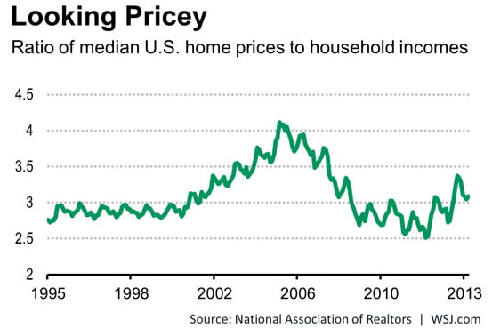 As you can see, the price-to-income ratio rides at about 3 to 1 in the years preceding the bubble, balloons over 4 to 1 during the bubble and looks to be approaching that ratio again today. The 3 to 1 ratio is close to the historical average and does provide some indication of sustainability in home prices.
But the above chart does not consider the cost of financing. Interest rates need to be considered when discussing “affordability” since they determine how much of a home a buyer can finance.
Enter another chart from NAR. This one looks at monthly payments of mortgage principal and interest on a median priced home as a share of household income. Prices are not approaching another bubble and actually appear to be a good deal, according to this chart.
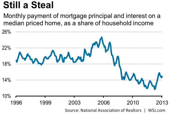
This chart is so off base, so misleading, it’s really egregious. No surprise coming from the trade association. But perhaps a disappointment coming from “the journal.”
Median malarky
First, for the sake of argument, let’s do away with the unreliability of median numbers in general. Really, it is impossible to conceive of a median home price in the U.S. The average cost of a single family residence (SFR) in the California’s Bay Area bears no resemblance to that of the average SFR in Dayton, Ohio. Nor do the median incomes.
So, right from the start, NAR’s use of a median home value across the entire country washes out anything like a reliable result. Instead, they ought to be using tiered pricing at least, such as is available from Case-Shiller (our choice for pricing data).
But the real problem lies in the obvious unreliability of the results. Are we to understand from this chart that today’s homebuyer is paying a mere 15% of their monthly income on their mortgage payment? If this chart is accurate, homebuyers were paying less than 30% of their gross monthly income on their mortgage payment at the absolute height of the Millennium Boom. If that were accurate, why did millions default?
The chart defies logic. Lenders have always qualified borrowers at 31% of their gross monthly income. And buyers, dear reader, spend every dime they qualify for. When home prices fluctuate, the percentage of a buyer’s monthly income spent on their mortgage payment rarely changes, the buyer simply gets less home for their money.
Two metrics that matter
First, in order to determine if prices are sustainable, the data need to be more local — at least statewide. Then they need to be tiered. After that one must consider two metrics: historical price movement and buyer purchasing power. Here’s one of our tiered pricing charts that shows the scale of today’s pricing bubble relative to the Millennium Boom and the historical mean price, in California of course:
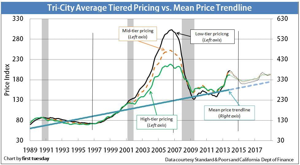
Currently, purchasing power is severely negative due to stagnant wages and rising interest rates. The mean price of California real estate remains well above the historical average, as determined by consumer inflation. Further, the velocity of month-over-month price inflation, especially in the major metro regions of California, is indicative of a mini-bubble.
Of course prices have not increased to levels comparable with the Millennium Boom. In the mid 2000s, an unprecedented confluence of speculator activity existed in tandem with millions of renters prematurely thrown into the real estate market via subprime lending. Now, we’ve got a lopsided bubble, fueled only by speculators with nary an end user in sight.
Check out our new interactive timeline to see how this drama is going to play out over the next several years. In the meantime, we recommend sticking with first tuesday if you’re interested in getting an accurate picture of the data that drives your livelihood.


This article provides a desperately-needed emphasis on two points of massive misunderstanding. The first is the widespread misuse of “median price”. As he notes, it is a virtually worthless metric for most of the purposes for which it is used. The only practical use of median [which is one of three types of “average”, the others being mean and mode] is for industry types who need to see where the middle of any particular market is. Related measures are the NAR statistics for quartiles or deciles;l these and medians help show where market activity is occurring.
The problem with median is that it is so commonly used to show purported home price movement. This is a complete fallacy, as the median home from one period to another is never the same. So it is comparing apples to oranges. Some years ago one honest article reporting the change in median CA home prices went further and noted that in the same period the median home size went from a 3/2, 1250′ home to 4/2.5, 2000′. So in no way could a comparison of medians differentiate how much of the increase was attributable to appreciation vs. increased size.
A further problem with median is that the median can be going up when prices are dropping and vice versa. Late in a hot market rapidly rising prices force buyers to buy lower in price, thereby lowering the median. In a falling market buyers begin to buy higher on the scale raising the median. Over long terms there will be sympathetic movement but not exact correlation due to other variables, such as home size, as shown above.
The article’s second important point is the near worthlessness of national statistics because real estate is so local in nature. Broad national averages provide little useful information to consumers about their local market, which is the concern of most.
Sadly, the perpetuation of the misuse of these statistics appears to be fueled by laziness in the media. Whereas, NAR and local ass’ns can quickly provide median statistics, finding and evaluating true comps is much more difficult, witness the differences even among experienced appraisers. So the mass media defaults to a knowing misrepresentation of price movement by using the readily available median.
Peter Schiff, the widely followed investment analyst and brokerage firm owner, predicted a drop in housing prices during the last half of 2013. That did not happen, and they kept rising. Here we are nearing the 3rd month of 2014, and they haven’t dropped yet. So when will they? The last chart above indicates a drop in 2014 and 2015 and a lateral slide through 2016 before they begin to rise again. That seems to be the view supported by First Tuesday, judging by past articles.
So, should a buyer wait a few months to see what happens? If the world’s currencies are reset (as rumors of that have been floating since the world’s leaders met in Davos) the dollar will surely be revalued downwards. What affect might that have on house prices? It would be great to see First Tuesday address that possibility.